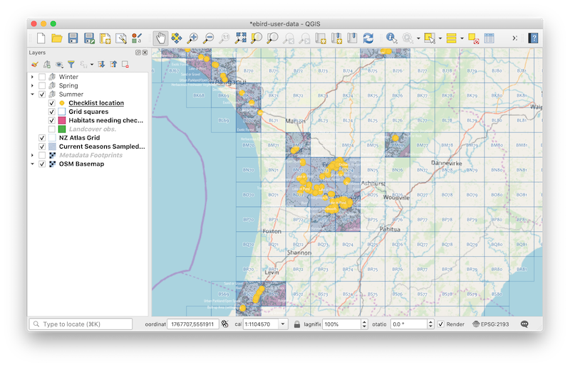
So, how have we been assessing our sampling effort?
In short, at the end of each days collection of checklists, we download our data from the eBird website (a later post might cover this topic, but it is reasonably straight-forward), process it through an R script, and then map it using the free and opensource GIS tool, QGIS.
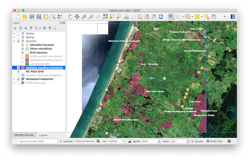
The net result, is a searchable map that allows us to look at checklist locations, within the NZ Atlas grid sqaures, and to identify habitats that remain to be sampled (based on the landcover database, LCDB, v4.1). It should be noted that the LCDB v4.1 was current as at 2012, so is a little out of date.

The map brings a number of useful feature together in one place:
- You can see where your checklists are within each grid square
- You can get an idea of the coverage you are achieving
- Habitats yet to be sampled within each square are highlighted
- You can zoom into the data and get an idea of where to sample next
- You can compare sampling effort from season to season
The most useful feature, however, is the ability to see other birders checklist locations (obtained by scraping the NZ Atlas website - there will be a post on this later) - see image below. This provides a better idea of where to sample next, by excluding those habitats already sampled by others. This feature is not available through the NZ Atlas website (and rightfully so, as the LCDB data is a little out of date, and also misses a number of habitat types; however, by having access to this data, it provides an overview for the birder for them to make decisions about where to sample next).
